This worn-out cliché has come to be known by all as a reference to being quick to judge people, places and things by outward appearance, without giving them a real chance. As readers we take this adage to heart, sometimes without meaning to—it can’t be helped. We are drawn to what attracts us through our senses. And since we cannot smell a book (at least not at a distance—love the smell of new pages pressed to my nose, though), or hear it, the first aspect to catch our attention is, of course, the visual. We’ll check the title next, or perhaps the author, read the blurb describing the hopefully wondrous contents between the front and back of the well-crafted covers.
Or at the very least, that’s the idea, the grand plan.
As authors, we are perhaps even more aware of the treacherous vagaries bound into our book covers. A bad or mediocre image, or merely one that does not reflect the novel’s content, can dampen sales. Traditional publishers employ professional, often freelance, artists, but even they have been known to occasionally fall short of the mark.
A cover is the crucial first impression. We can all hope what we’ve written will draw the public’s interest, but if we can’t get them past that first look, where are we? If you have ever walked up to a rundown restaurant, have you turned away or paused to read a menu plastered to a smeared window that sounds amazingly interesting after all? More than likely, you’ve walked away. Something more is needed to entice a body inside. What is needed is a welcoming door.’
A couple winters ago, I took a turn through my local Barnes & Noble with nothing particular in mind. I wanted to be inside a brick and mortar bookstore. However, while I traipsed around aimlessly, absorbing the bookiness (I know that’s not a word) of the place, a cover caught my eye on a hardback for sale in the “new adult” section. I walked over, pulled it down, studied the lovely image, read the reviews on the back, about the book and the author on the inside flaps. The author was unknown to me. Nevertheless, I shelled out $18.99 plus tax and went home the proud owner of Wintersong. The cover’s promise was fulfilled by the book’s contents. This book was as poetically expressive as the title suggested, evocative, involving, and imaginative.
Conversely, one could make a shambles of one’s writing debut if you’ve enticed readers with a wonderful cover and the interior is as rotten as an old apple.
So, I guess what I’m blathering on about, most particularly to those engaged in the limitless opportunities offered by self-publishing, is this—don’t permit the cover or your words to let you or your readers down. A cover’s purpose is to:
- Engage the reader visually and immediately
- Depict the genre in a recognizable fashion
- Make a promise to the reader regarding the book’s contents (and follow through)
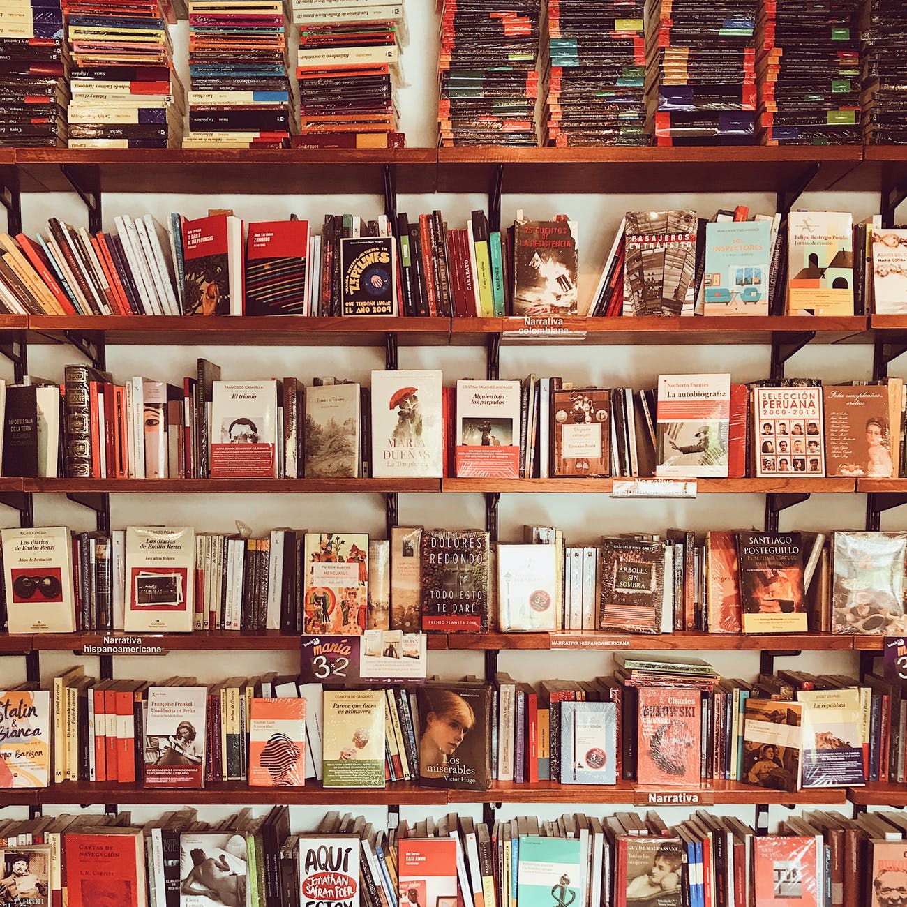
So, peruse your local bookstore or an on-line marketplace for books in the same category in which you are writing. Check out science-fiction, fantasy, cozy mystery, hard-core mystery, crime novels, romance, middle grade, young adult, historical fiction, non-fiction—whatever matches your subject matter.
Romance and young adult/children’s books will likely have the most varied covers, due to the range of sub-genres. Even so, all books in a category will have something in common to give a reader a “feel” regarding what they can expect from the novel’s contents.
You may note certain fonts, images, layouts being used. Some may consistently utilize photographic images, others illustrations. For example, photos are mostly used for thrillers and mysteries, although cozy mysteries will most likely be depicted by an illustration. Young adult novels can have photographic covers, but middle grade/children’s books nearly always bear an illustrated cover. Science fiction has a certain popular font; as does fantasy. Both these may utilize photographic covers, but fantasy usually lends itself to illustrative. Check them out and get a feel for the genre.
While you do want your cover to stand out and, of course, always be original, it is important to display the elements of your genre—the promise to your readers as to what they will find inside.
For those who are both artistic and computer savvy, you may be able to craft your own covers using programs such as Adobe Photoshop or Corel (formerly Paint Shop Pro). I use the latter when creating cover art for my self-published works. Images are available on a variety of sites for a fee or free, and can be downloaded for manipulation on your computer. Always check the terms of use, and make sure you are not infringing on copyright. Also, when creating a book cover, follow instructions regarding size, bleeds, etc. The cover specs needed to display your image on, say Amazon, for your digital release, is a totally different animal from what is needed for a print book, or even for touting on your favorite social networking site.
If you don’t have the expertise to prepare you own cover, then you can, and should, pay for a cover artist to create a cover for you. It can’t be repeated enough that when it comes to book covers, first impressions count. You’ve worked so hard writing your book, gnashing your teeth through all the edits, making your story the best it can be—don’t shortchange yourself on the artwork.
If you are introducing a series, it’s always important to make the covers similar in nature so that they are immediately recognizable as being a serial, by layout, font, or some other defining commonality.
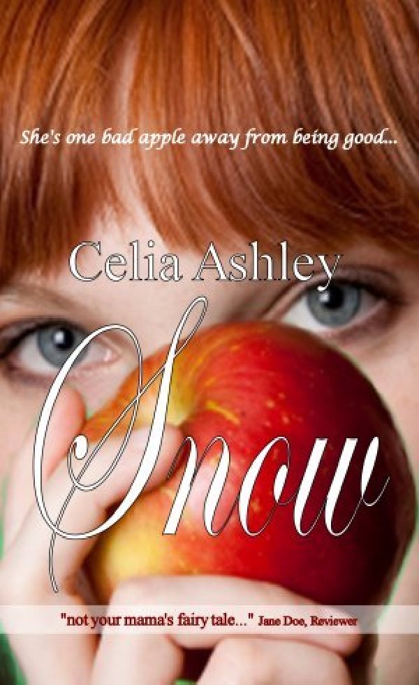
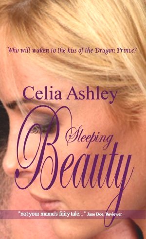
Below are three mockup covers I did for what I called in my head the Sassy Redheads Series. Fairytales re-imagined, the reader would receive the impression of a strong, sexy heroine. These books still dwell only in my head… You can find more HERE.

Also for your information, these are two cover designers with which I am familiar.
https://www.syneca-originalsyn.com/
http://www.covertocoverdesigns.com/
Remember, book covers are your first intro to the reading world. Make them count!
This blog is also available as a podcast at anchor.fm/robin-maderich/
Discover more from robin maderich - write-brained scribbler and crafter-on-the-loose
Subscribe to get the latest posts sent to your email.
